

Selecting imagery
The following criteria apply to both pillars. (Apex Perspective and Curiosity Moments)
Photos by themselves are like record singles, but their arrangement is the album you build.
When searching for images and deciding to use apex or curiosity moments,rounded-rectangle or lozange frames, bright or muted colors, always think of cadence. Use a sequence that makes sense for your content and adds visual interest from page to page.
The following tips describe what to look for when you’re choosing an image, not how to edit one. We don’t ask anyone at Cint to color-correct, retouch, or filter the images they use. The work is in selecting well.
Usage Notes
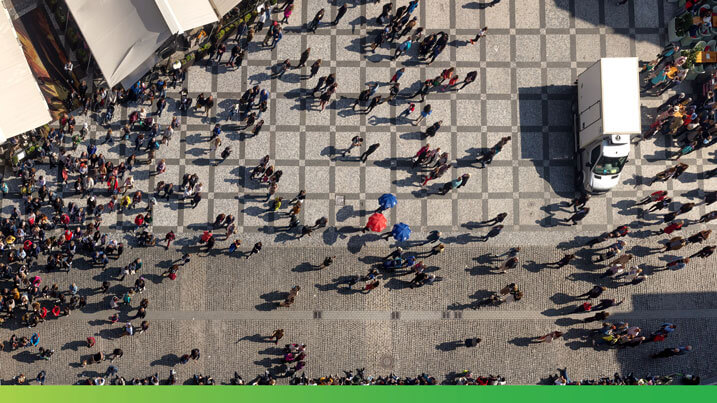
Perspective
We work in two camera angles. Overhead (for Apex Perspective) and eye level (for Curiosity Moments).
Avoid low-angle hero shots, three-quarter angles, and tilted drone perspectives.

Framing
Look for images that have been photographed with composition in mind and that use tenets like horizon lines, lead-in lines, rule of thirds, etc. Photos with these qualities can offer visual cues to help you decide where to place content.
Avoid crooked horizons, cluttered backgrounds with no clear line to follow, and crops with no room left for text.

Composition
The strongest images have a clear focal point and use the environment to support the subject. Look for natural framing devices in the scene, like windows, doorways, or architectural lines.
Avoid empty centers, symmetrical compositions that feel decorative, and subjects floating against a featureless background.

Color
Color should feel found, not added. Some examples are painted buildings, colorful markets, blue water, green fields, the warm tones of late afternoon light.
Avoid images that have an obvious filter, color wash, or gradient applied in post-production.
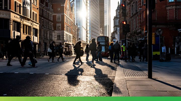
Lighting
Natural light is the default. Daylight, golden hour, the soft light just after sunrise or before sunset. Look for visible direction in the light and shadows that ground the subject.
Avoid obviously studio-lit images, heavy HDR processing, and any sparkle/lens flare that wasn’t in the original scene.

Focus
We recommend having a clear and focused subject in your composition.
Avoid heavy background blur, tilt-shift effects, or anything that softens the environment to isolate the subject.
What to avoid
Some patterns show up over and over in B2B stock photography.
These are the ones we screen against.
Clichés
Images you’ve seen too many times in too many places. They don’t add anything new to what you’re saying.
- A staged team of professionals laughing at a laptop
- A handshake across a conference table
- A lightbulb above someone’s head
- Puzzle pieces fitting together
- Sticky notes on a glass wall
- Hands reaching toward a glowing icon
- Anyone in a headset gesturing emphatically
A useful test: If you can imagine the same image on a competitor’s website, then consider a different one.

See-say
The image and the headline shouldn’t repeat each other. If the headline talks about speed, the image shouldn’t show a stopwatch. If the headline talks about data, the image shouldn’t show a chart. The image gives the reader something to look at while the words tell them something. When they say the same thing, the whole piece feels thin.
A few specific pairings to avoid:
- “Real-time insights” with a clock or stopwatch
- “Connect with consumers” with a globe and connecting lines
- “Scale your research” with an upward chart
- “Diverse audiences” with a staged unnatural group portrait

Effects and filters
The image we use should be the image as it was taken. We don’t add atmosphere in post-production.
What to avoid:
- No unnatural light leaks or lens flares
- No added film grains
- No color overlays or washes
- No added vignettes
The images we use carry a quiet promise that what you see is real. We don’t manipulate that promise in post-production.
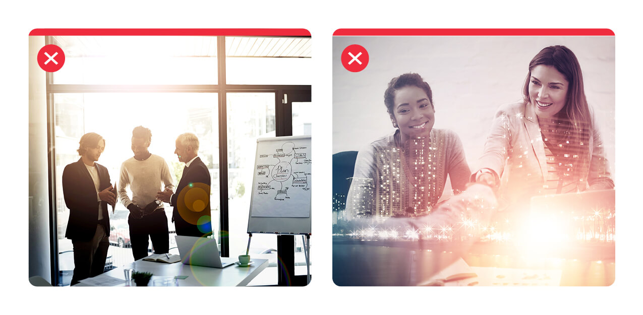
The images we choose should feel like real life. People in our images can look engaged, interested, focused. They shouldn’t look like they’re having the best day of their professional careers.

Finding the right image
Think outside the box! It’s very easy to fall into the habit of selecting photos that include technological devices because of their popularity and how quickly they can be found online.
A picture of someone receiving a package at their front door may communicate the idea of “online shopping” as effectively as someone literally shopping with a laptop. This helps reinforce the people aspect of our business more thanthe tech hardware tools.
Before you start searching, check the Cint image library. It contains pre-selected images that have already been vetted against the guidelines on this page. If you find something there that fits, you don’t need to source anything new.
If you do need to look further, run your candidate image through a short check:
- Does it fit one of our two pillars?
- Does it meet the criteria in Selecting imagery?
- Would it look right next to images we’ve already published?
If you can’t answer yes to all three, it’s probably not the right image.
When in doubt, the design team is happy to help.