Logo usage
The Cint logo is our hallmark
Cint is the pioneer of programmatic market places for the market research industry.
Cint invented ResTech and we have the determination to continue evolving the industry.
Primary logo
Our primary logo should only be used on solid or gradients backgrounds. The Primary logo should be in Abnormal Aubergine (#2A0B57) or white on a background that provides clear readable contrast.
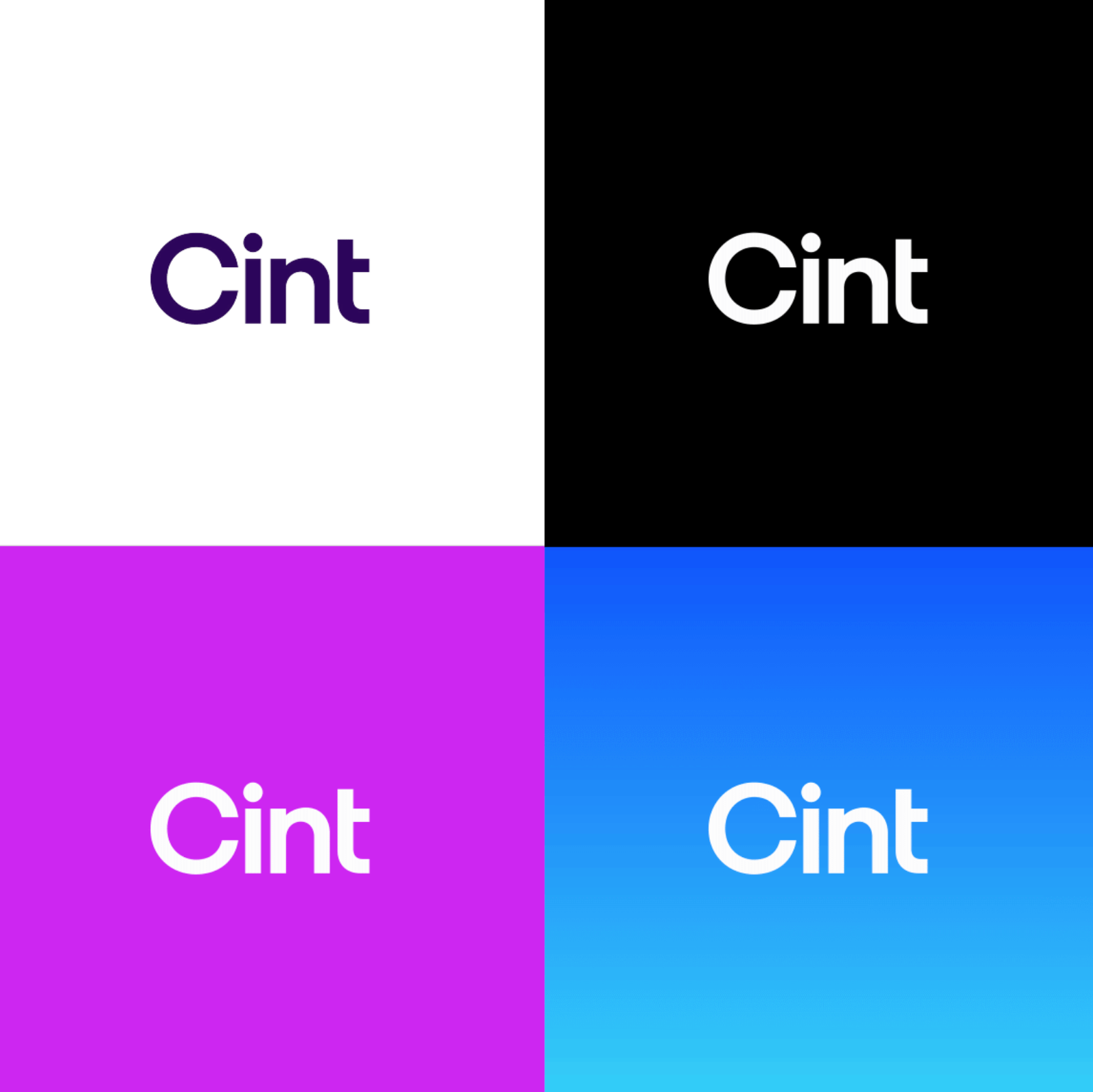
Backgrounds
The Logo may be used on images with appropriate contrast and clear space. Avoid using the logo on any image that does not provide readability or appear too busy.
Variations
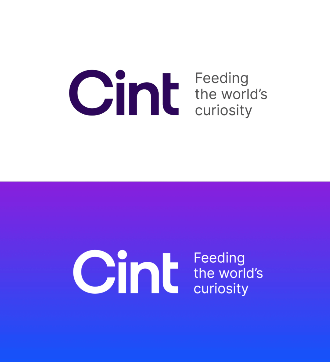
Lockup logo
Our logo can also be paired with our purpose of “Feeding the worldʼs curiosityˮ. The tagline should be stacked next to the logo as displayed.
Clear space
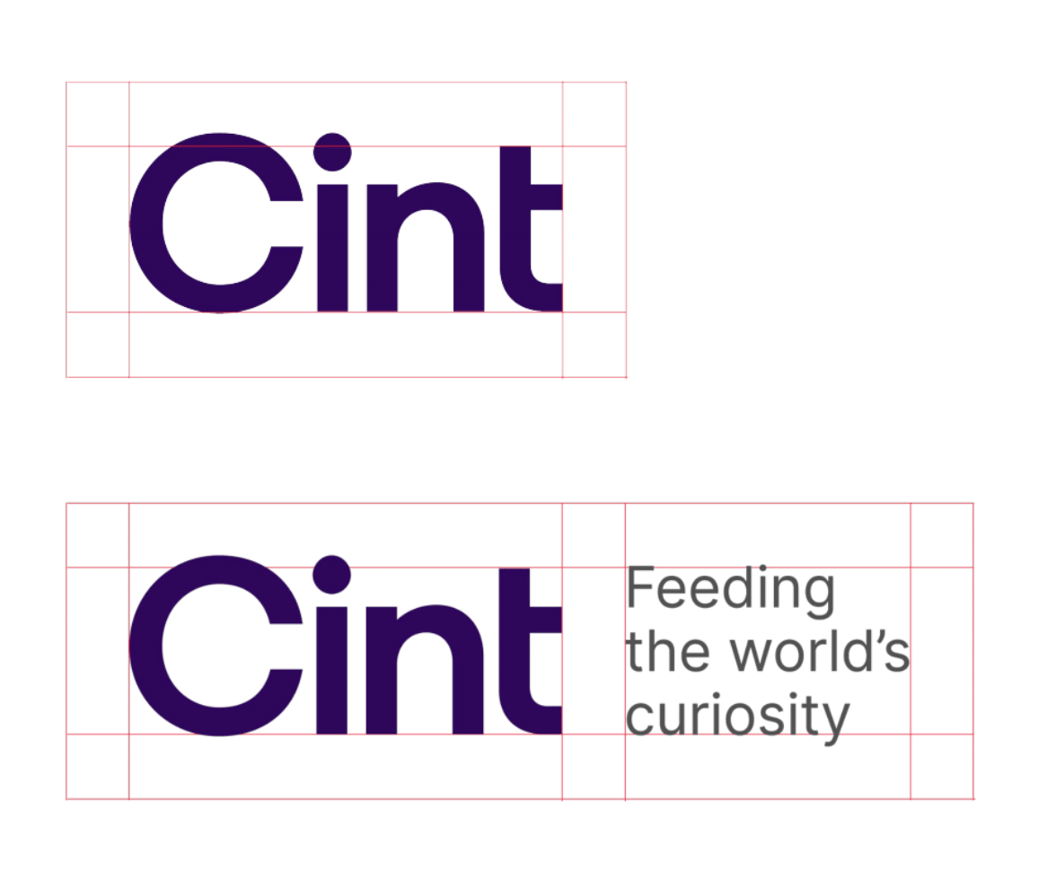
Let it breathe
The logo is our key identifier. Let it breath. Do not be crowd with other elements inside of the safe area.
Color palette
We avoid the overuse of dark or dull colors.
The Cint base color palette is fresh, alive and vibrant. It is approachable but surprising.
We classify three types of color: Primary, Secondary and Tertiary.
Core brand colors
Primary palette
Abnormal
Aubergine
#2A0B57
R42 G11 B87
C85 M100 Y0 K23
Pantone 2617
Primary palette
Peculiar
Purple
#891FDC
R137 G31 B220
C54 M86 Y0 K0
Pantone 7442
Mysterious
Magenta
#C83FE2
R205 G27 B241
C36 M89 Y0 K0
Pantone Purple
Secondary palette
Baffling
Blue
#1056FB
R16 G86 B251
C90 M44 Y0 K0
Pantone 2174
Gadzooks
Green
#30A941
R0 G168 B45
C80 M0 Y100 K0
Pantone 2422
Tertiary palette
Remarkable
Red
#FC1F38
R252 G31 B56
C0 M93 Y82 K0
Pantone 1788
Perplexing
Pink
#F86EBF
R252 G171 B220
C3 M29 Y0 K0
Pantone 2365
Odd
Orange
#FF8A29
R255 G164 B13
C0 M36 Y100 K0
Pantone 136
Yahtzee
Yellow
#FFD857
R249 G192 B52
C0 M2 Y80 K0
Pantone 114
Color Ramps
Primary and secondary ramps
Our secondary ramps offer a seamless transition of vibrancy, spanning from the core base to its most delicate and deep iterations. By meticulously crafting each tint, we harness the concept of illumination to bring depth and dimension to every application.
Primary ramps
Peculiar Purple
900
#52177D
800
#6E1BAC
700
#891FDC
600
#982EEF
500
#AC51FB
400
#C280FF
300
#D29FFF
200
#E1BFFF
100
#F0DFFF
50
#FCF3FF
Mysterious Magenta
900
#7F138B
800
#9722A7
700
#B031C6
600
#C83FE2
500 Core brand color
#C83FE2
400
#E673FF
300
#EC94FF
200
#F1B6FF
100
#F7D9FF
50
#FCF3FF
Secondary ramps
Baffling Blue
900
#1C3993
800
#1C45B3
700
#1C51D5
600 Core brand color
#1056FB
500
#337DFD
400
#54A2FF
300
#80B9FF
200
#A5CDFF
100
#CEE4FF
50
#F0F7FF
Gadzooks Green
900
#04440E
800
#136720
700
#228830
600 Core brand color
#30A941
500
#3EC950
400
#64D572
300
#88E093
200
#AEECB5
100
#D6F9D9
50
#EFFDF0
Tertiary ramps
Odd orange
900
#851E00
800
#BA2E08
700
#D1420A
600
#E35209
500
#F76C16
400 Core brand color
#FF8A29
300
#FDA63F
200
#FEC880
100
#FEE9BE
50
#FFF6E5
Yahtzee yellow
900
#7A350D
800
#99410C
700
#C25806
600
#EB7E02
500
#F76C16
400
#FFC033
300 Core brand color
#FFD857
200
#FFE58A
100
#FFF4C6
50
#FFFBE8
Remarkable red
900
#871522
800
#A31122
700
#C51024
600
#E01028
500 Core brand color
#FC1F38
400
#FF6677
300
#FF8D9A
200
#FCC5E7
100
#FFD7DC
50
#FFF3F4
Perplexing pink
900
#871449
800
#A21255
700
#C41267
600
#E12182
500
#F242A4
400 Core brand color
#F86EBF
300
#FCABDC
200
#FCC5E7
100
#FDDCF0
50
#FEF4FA
Neutrals
Gray
50
#F9F9F9
100
#EFEFEF
200
#E3E3E3
300
#D8D8D8
400
#BDBDBD
500
#A2A2A2
600
#878787
700
#6E6E6E
800
#525252
900
#3E3E3E
950
#292929
Gradients
Primary gradients

Secondary gradients

Mixed gradients

Our typography
We communicate clearly and inspire big ideas.
Hero
Moderustic
Our headline typography is legible and communicates its message well, but doesn’t conform to static typography rules.
Itʼs dynamic and offers subtle moments of curiosity through its letter forms.
abcdefghijklmnopqrstuwxyz
abcdefghijklmnopqrstuwxyz
abcdefghijklmnopqrstuwxyz
Body
Inter
We answer our curious questions with detail that is straightforward, anchored and easy to understand.
abcdefghijklmnopqrstuwxyz
abcdefghijklmnopqrstuwxyz
abcdefghijklmnopqrstuwxyz
Headline special glyphs
Wherever possible Moderustic headlines should utilize alternate glyphs for several characters. These glyphs are more lively and inviting. The curved shapes add a sense of warmth and openness, creating a more engaging and magical look that grabs attention and sparks curiosity.

Graphic elements

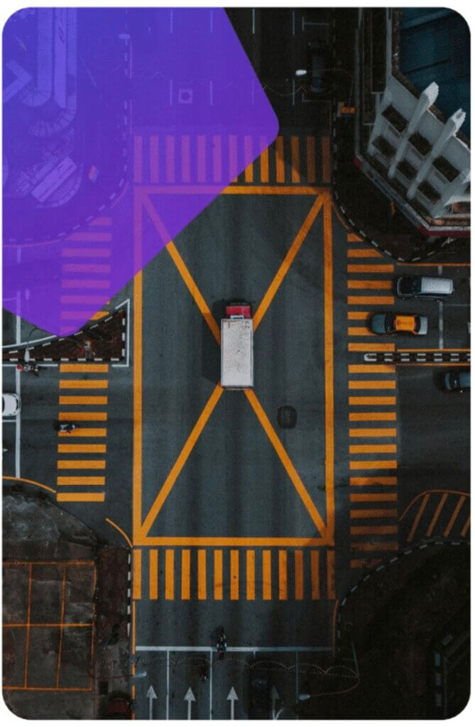
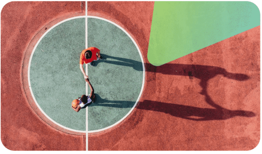
Shaping curiosity
These shapes are reflective of the state of playfulness. These shapes have soft rounded corners. We use them sparingly as bold accents behind images or overlaid on top of aerial images
Shapes
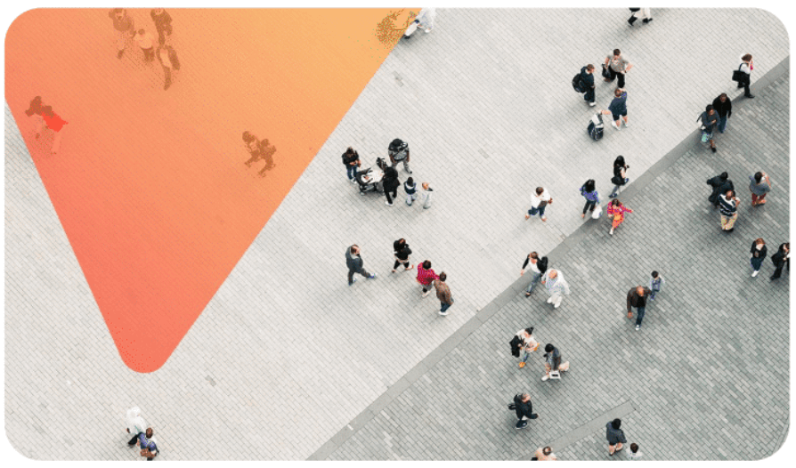
Shape overlays
Aerial images can include a branded overlay treatment using a shape with soft rounded corners and connected gradient that brings additional illumination to the focal point.
Icons
Library
We use a library of icons to illustrate concepts and features. Our icon set is based on the publicly available Phosphor icon library.
Usage
In marketing materials, icons can be used in their regular weight—either on their own or within a circle using one of our primary or secondary brand colors. Avoid icons that appear too busy; simplify them as needed to ensure they fit optically within the circle.

- Icons should be optically centered within the circle.
- Icons should always use a white stroke to ensure sufficient contrast.
- Icons should be large enough to fill the circle, while maintaining adequate optical spacing around the edges for balance and legibility.